The Challenge
Despite its prime location and commitment to eco-luxury, Aruna Belize’s previous branding did not fully capture the high-end elegance and cultural richness it intended to convey. The visual identity lacked sophistication and emotional resonance, making it difficult to attract and convert discerning travelers seeking elevated, experiential stays. Aruna needed a cohesive brand system that reinforced its premium positioning while staying true to its natural surroundings and philosophy of connection.
The SOlution
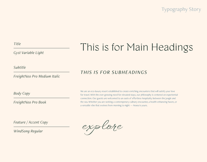
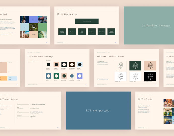
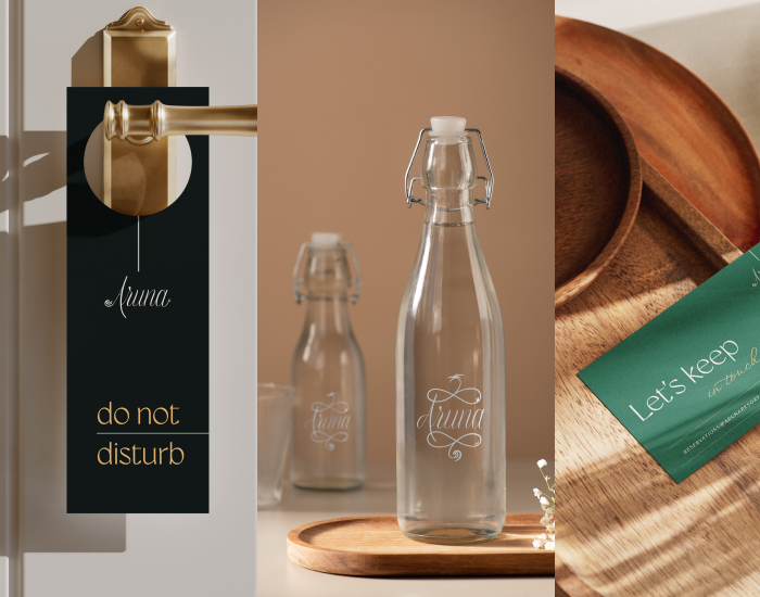
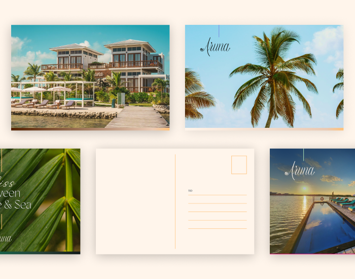
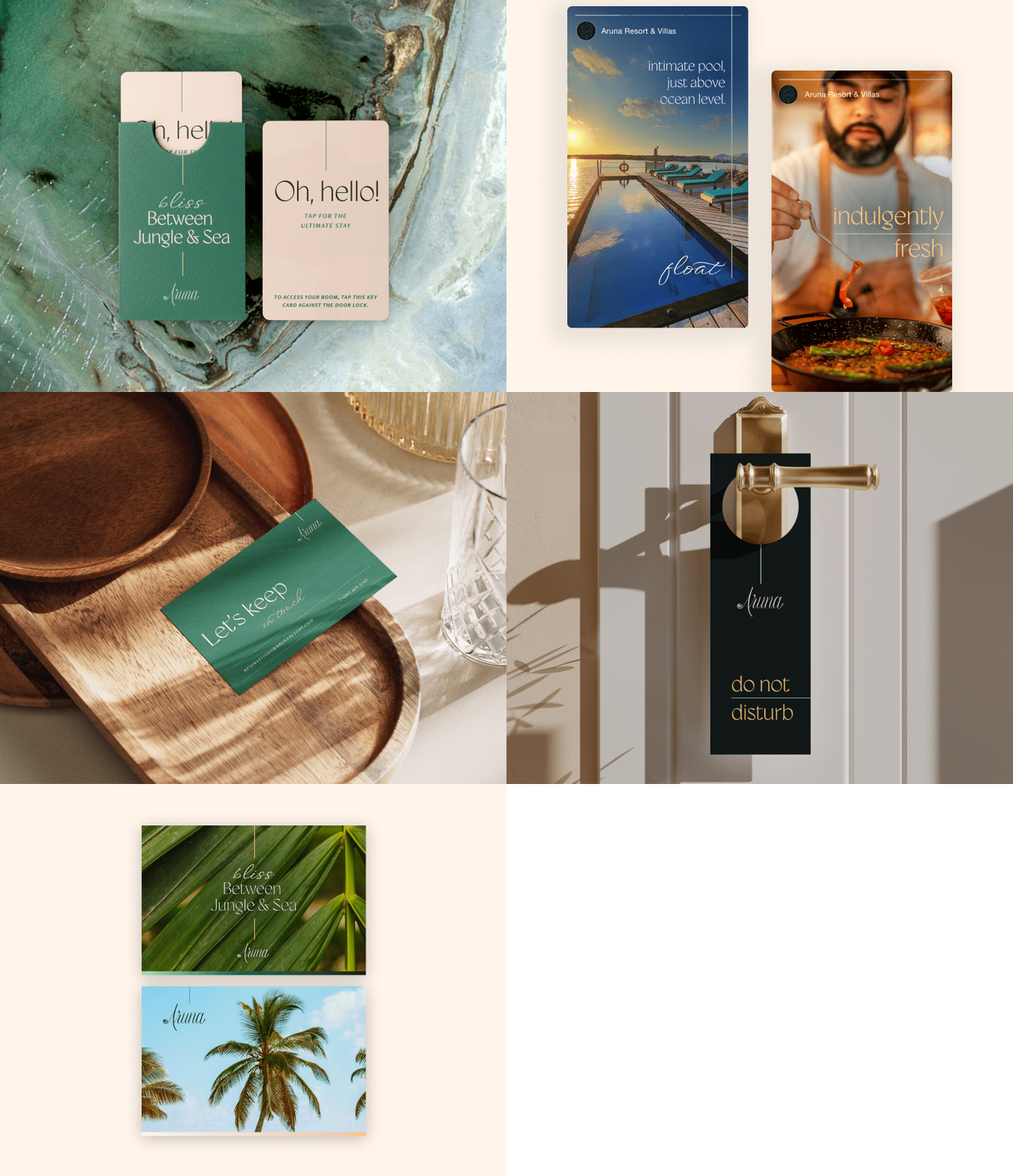
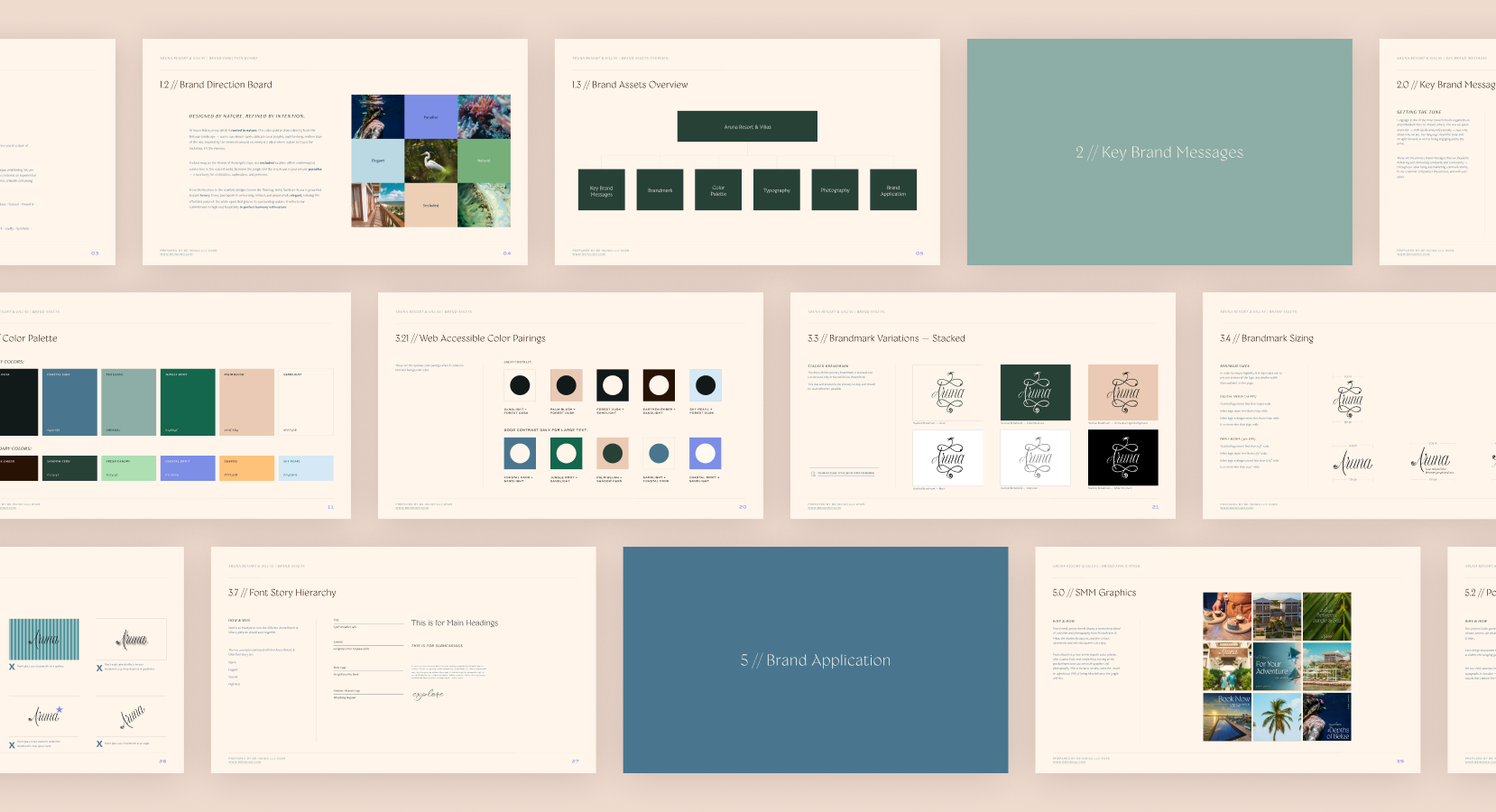
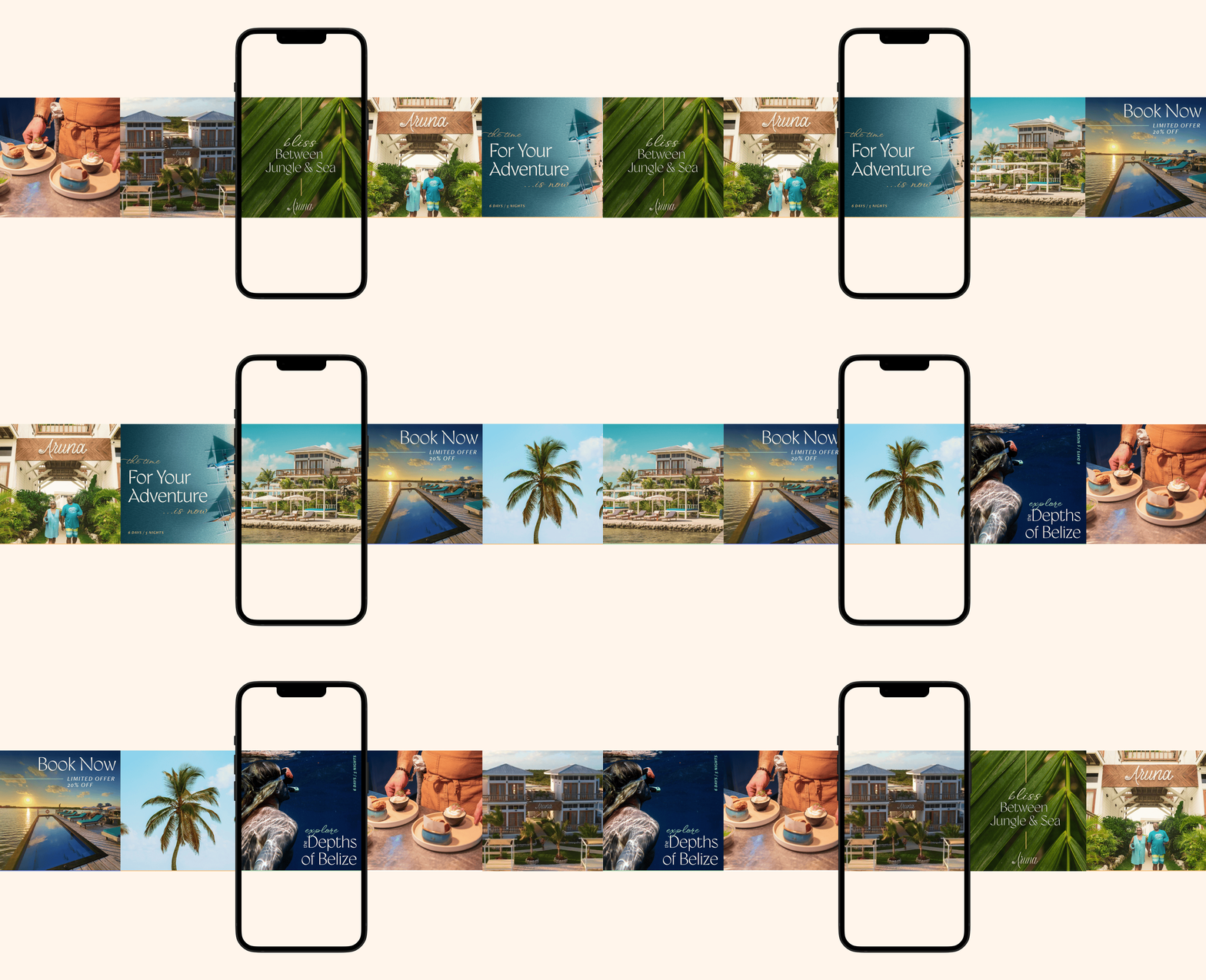
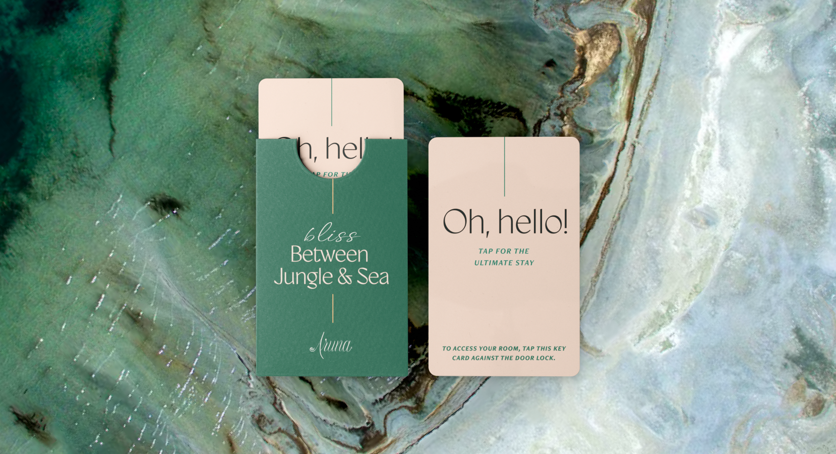
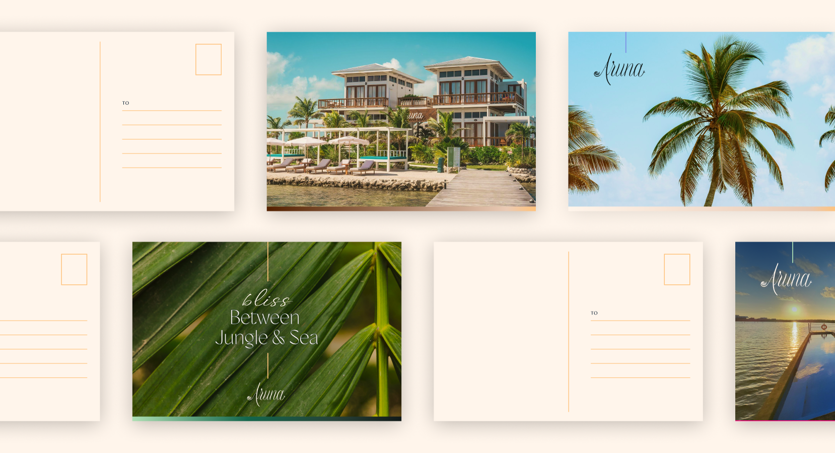
We refined Aruna Belize’s brand identity with a broadened color palette inspired by the Belizean landscape—sun-kissed sands, coral hues, and the bold blues of the Caribbean Sea. New typography treatments and logo combinations brought flexibility and consistency across applications. A deeply comprehensive brand guide solidifies use cases for social media graphics, marketing collateral, signage, and in-room amenities such as toiletries and door hangers. Photography guidelines emphasize vibrant, spacious imagery that capture both the dynamic local experiences and the serene luxury of the resort. Together, these elements create a versatile, refined identity system that seamlessly communicated Aruna’s story across all guest touchpoints for many years to come.

The Result
The refreshed branding establishes a clear identity for Aruna Belize—one rooted in understated elegance and natural sophistication. Anchored in the landscape and culture of Ambergris Caye, the system offers a cohesive visual language and flexible toolkit for every touchpoint. The brand guidelines go beyond design execution, clearly articulating the why and how of the strategy, and providing a foundation that supports consistent application and long-term growth.
